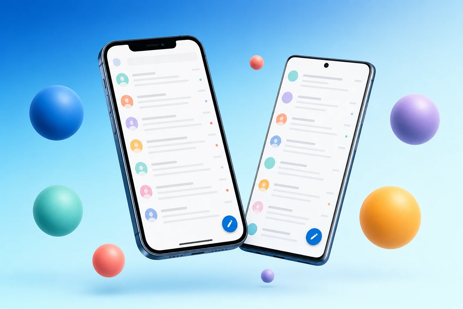
The BlueMail iOS and Android apps have been rebuilt for 2026. New visual language. New typography. Reworked gestures. Faster animation. A reading experience that finally lets the content breathe and a composer that gets out of the way. This isn’t a coat of paint — it’s the most significant overhaul the apps have had in years.
This is the story of the decisions that got us here.
Start with what doesn’t change
Before any color picker or font swatch, we wrote one sentence:
Calm, fast, beautiful — in that order.
That ordering matters. We’ve passed on more than one beautiful idea because it was loud. We’ve passed on more than one fast idea because it was hostile. Every decision below was tested against those three words.
A new visual language, native on each platform
We rebuilt the design tokens from scratch (colors, type, motion, spacing) and then re-implemented them twice, the native way on each platform. The result is an app that finally feels at home wherever it lives:
- iOS picks up SF Pro for system menus, Dynamic Type for accessibility and adopts the language of iOS 18+ controls: pill segmenteds, contextual menus on long-press, fluid dismissal gestures, blurred bars that respect the system materials.
- Android uses Material 3 expressive components: dynamic color where the user opts in, ripple-led interactions, predictive back and Wear-companion-aware notification grouping.
In both cases, the new design language is grounded in a five-color accent palette: the BlueMail blue, plus coral for action, mint for security, lavender for AI and amber for highlights. Each accent has a paired soft variant, used to subtly color-code features without ever shouting. Clusters get a wash. Encrypted threads get a tint. The Later Board glows quietly amber. Nothing screams; everything signals.
Reading mail, finally a pleasure
The single thread view is the screen people see most. We treated it that way.
- Generous typography. A new modular type scale narrows letter-spacing as size grows, opens it up at body sizes. Headings settle. Body text relaxes. Long-form mail reads like a well-set article.
- Smart media handling. Inline images decode progressively and lazily. Linked previews unfurl in-place. Quoted history collapses by default: one tap to expand a single ancestor, swipe to expand the full chain.
- Live trust indicators. PGP-encrypted messages show a clear locked-and-verified badge. S/MIME signatures get an inline trust pill with the signing fingerprint a tap away. Pixel trackers are detected and stripped on display, with a small “blocked tracker” pill where one used to live.
- Reader mode. A new full-bleed reader presents the message body without chrome, great for newsletters and long correspondence.
A composer that gets out of the way
Writing email is half the job. The composer was due for an honest rethink.
- Distraction-free by default. The To/Cc/Bcc lines fold into the header bar; attachments tuck into a row at the bottom. Your draft has the screen.
- Inline GemAI. Drag-select any range and a soft accent toolbar offers Rewrite / Shorten / Soften / Translate. No modals. No round-trips you can see.
- Per-thread defaults. Reply to an encrypted thread and the lock is already engaged. Reply from an alias and the From line is already set. The composer remembers per-recipient preferences.
- Smart attachments. Drop a 50-page PDF and BlueMail offers to send a link rather than an attachment; tap to keep the attachment if you’d rather. Drop a photo and EXIF location is stripped by default, with one tap to keep it.
Gestures, rebuilt
We tested 16 different swipe schemes with real users. The winner is the one we ended up shipping by default:
- Short swipe right → snooze (with a customizable destination: Later Board, tomorrow morning, next week).
- Long swipe right → archive.
- Short swipe left → flag (custom label colors).
- Long swipe left → delete (with undo).
Every gesture has a haptic that matches its weight. Every action has an undo that lives in the bottom bar for ten seconds. Every long swipe shows you the destination before you commit.
Performance you can feel
Numbers from internal benchmarks on the 2026 builds:
- 40% faster cold start on iOS, 28% faster on Android (vs. our previous release).
- List scroll holds 120fps on ProMotion devices and is locked to 60fps everywhere else, even with 10,000-message folders.
- Memory footprint for a 50-account user is down ~22%; the unified inbox now streams cached state rather than holding it all resident.
- Battery: average background drain per day is under 1% on a typical 5-account setup.
Accessibility, on by default
The new apps are built around the assumption that every user is, at some point, a power-accessibility user, at the very least when their hands are full.
- VoiceOver and TalkBack support every gesture with full semantic labels.
- Dynamic Type scales the type system, not just the body text: the headlines, the chrome and the buttons all grow correctly.
- Reduce Motion disables every transform-based animation and replaces them with cross-fades.
- High-contrast theme ships native, switchable from the in-app appearance settings.
- One-handed mode on iPhone Pro Max and Galaxy Ultra reachability is now first-class.
Why this matters
It’s tempting to file an app redesign under “marketing.” But the design of an app is the app — it’s the medium through which everything else is communicated. A calmer inbox makes you calmer. A clearer composer helps you write a clearer email. A trust badge that’s visible without thinking makes encryption something you actually use.
We hope the new apps feel right. If anything jars, or if there’s something you’d love to see, we read every reply at hello@bluemail.me.
Try the new BlueMail
The 2026 redesign is rolling out across iOS and Android over the coming weeks. Existing users will be auto-upgraded; new users get it from day one.